Interactive
I’ve been designing and building websites for a long time. Since the 90’s. A lot has changed over the years, but the constants remain: eye-catching, inviting graphics that reel in viewers; compelling copy that keeps them engaged (with persuasive calls to action); smart architectural organization and intuitive navigation; and if it’s etail, an effectively proven sales tunnel that converts browsers to buyers.
Example A: this website. Every word, comma and period was written by me. The organization, navigation and flow…also me. The layouts and page design, the sliders, the videos and audio samples? Me, me, me. I’m not making this point to crow about it, but to demonstrate the argument I made on the Ad Agency vs Ad Guy page: that I can truly provide the full range of ad agency services (strategy, positioning, concept, copy, art direction, design, production) at a fraction of the cost.
Of course, interactive also means interactive advertising, so I’ll show some examples of that work after reviewing three of the websites I’m most proud of, starting with:
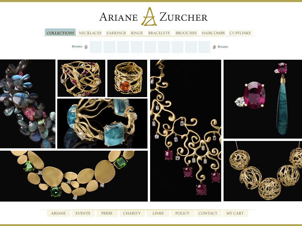
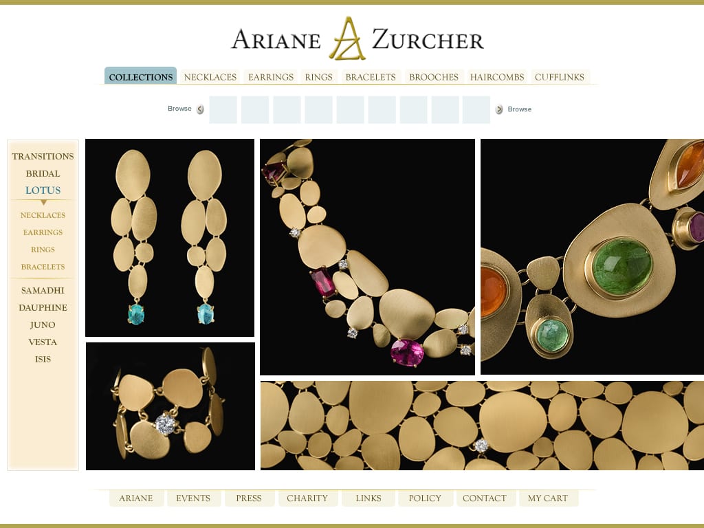
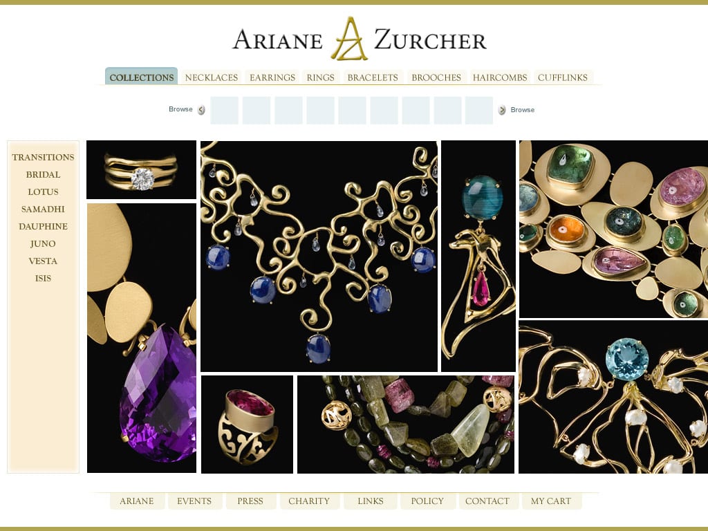
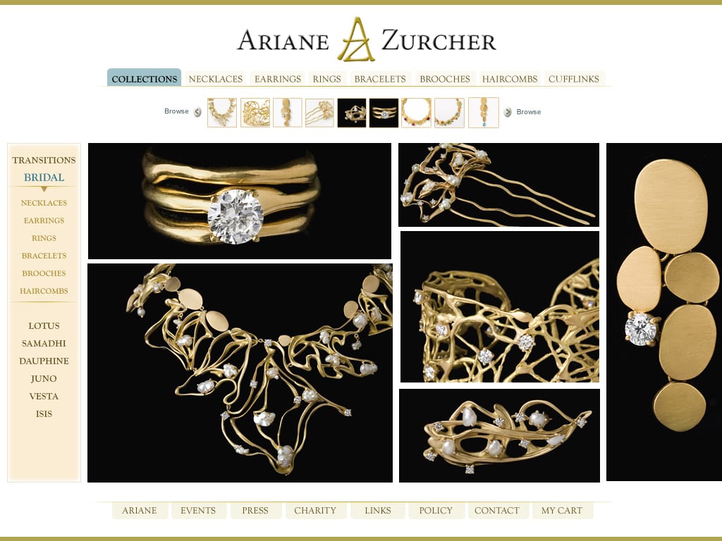
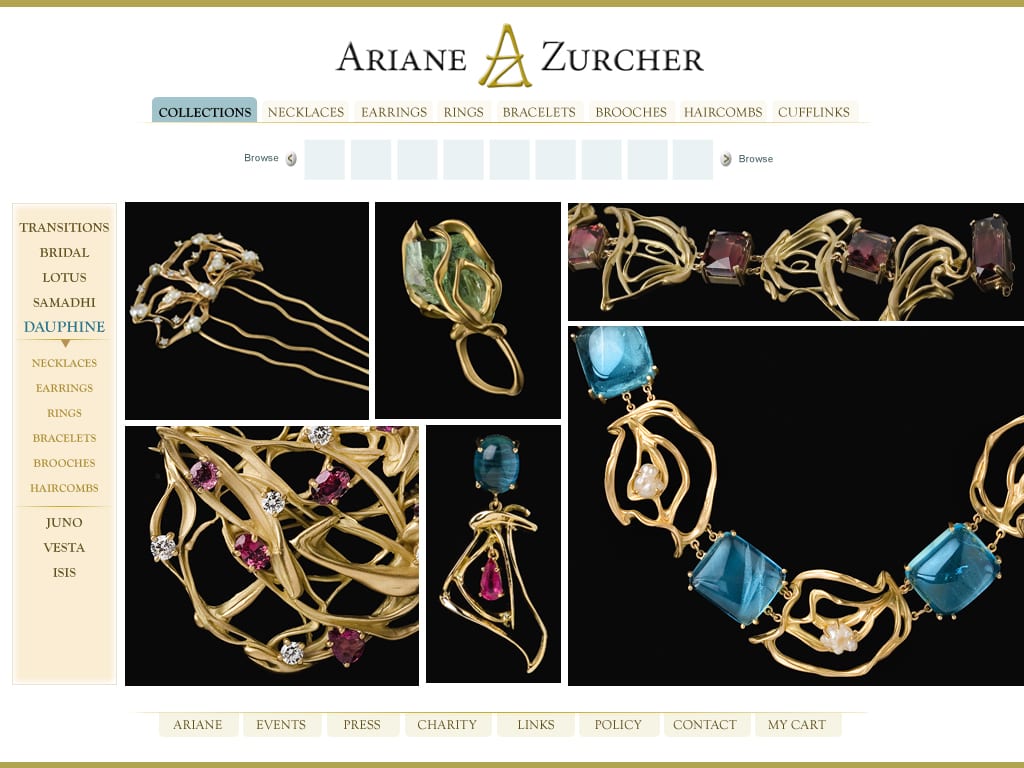
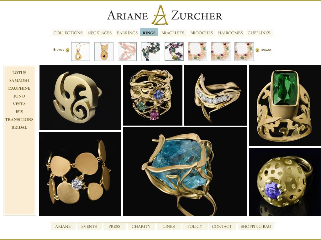
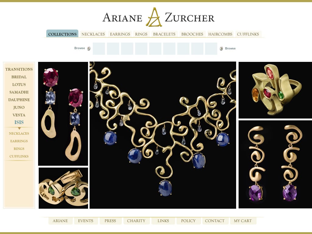
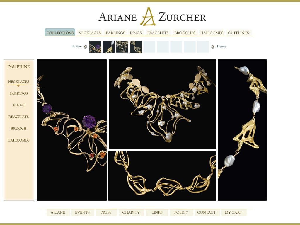
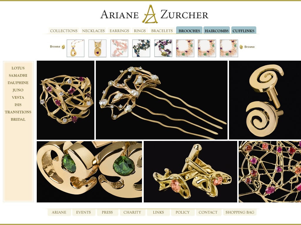
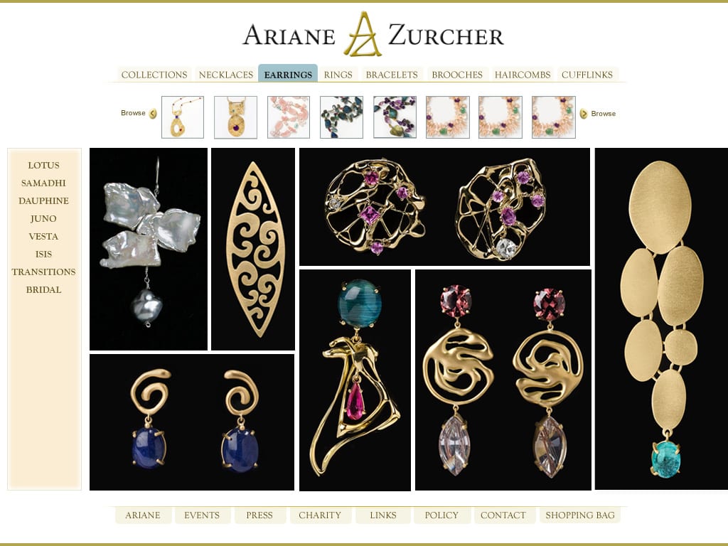
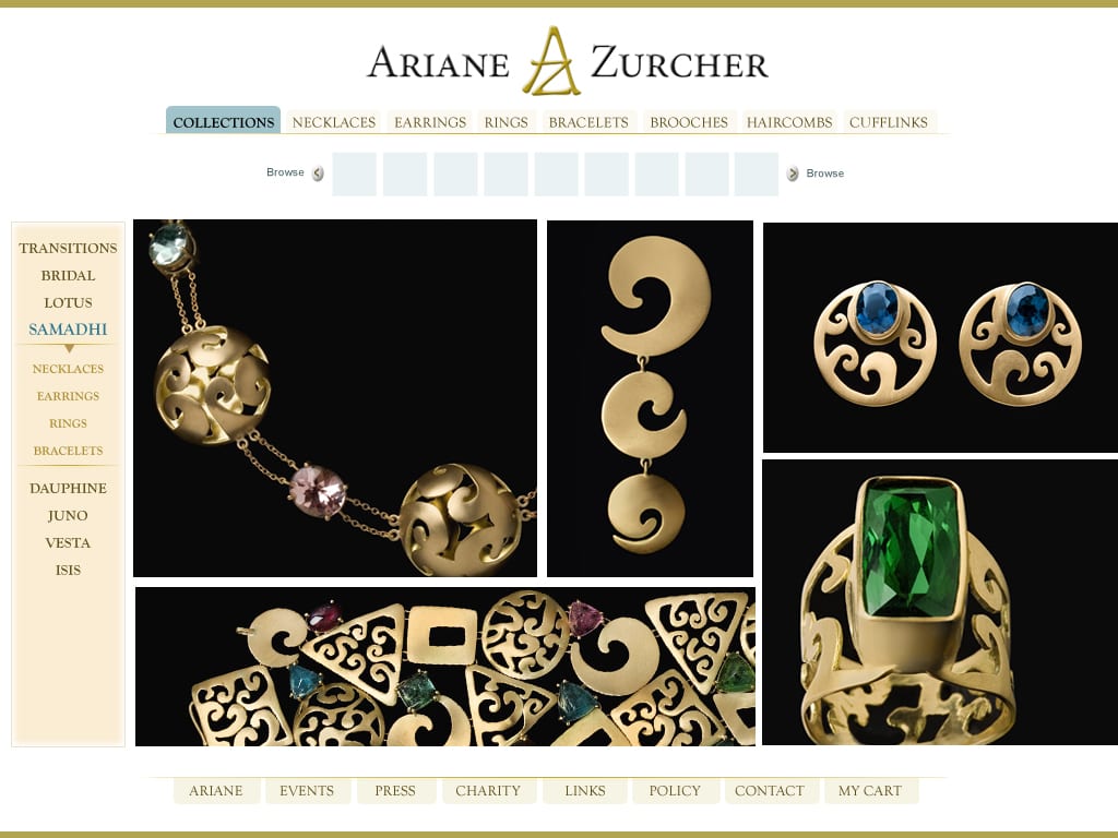
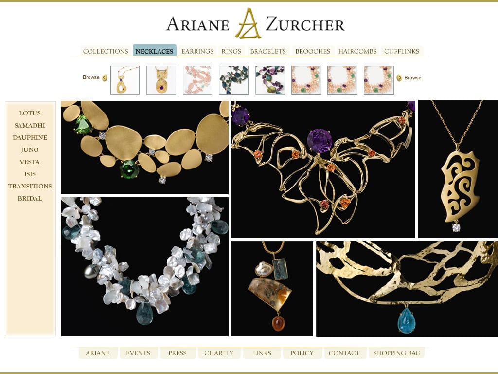
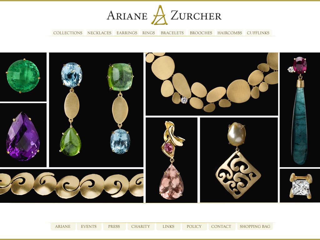
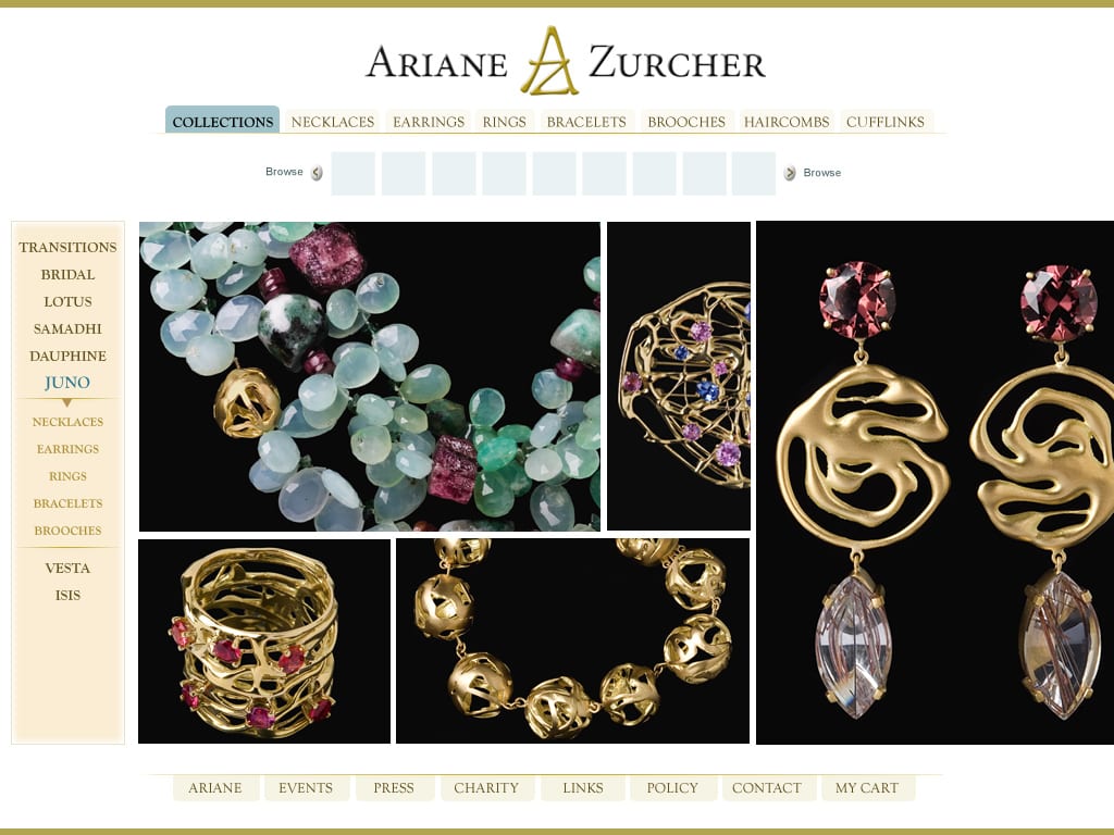
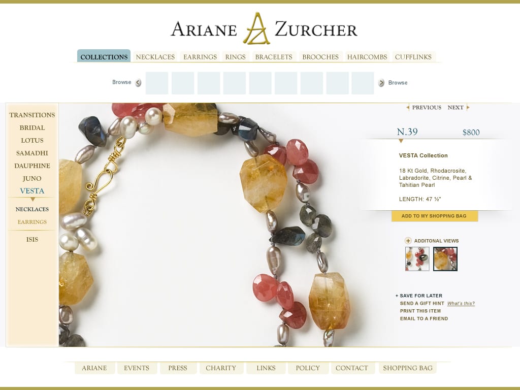
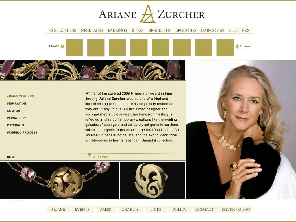
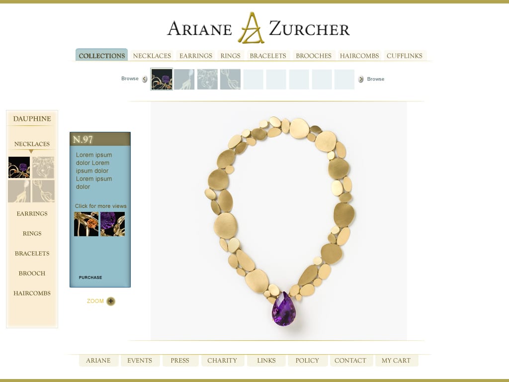
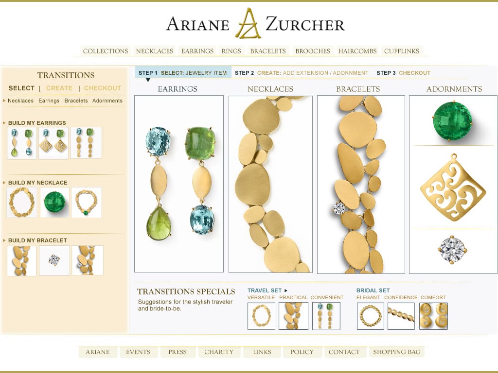
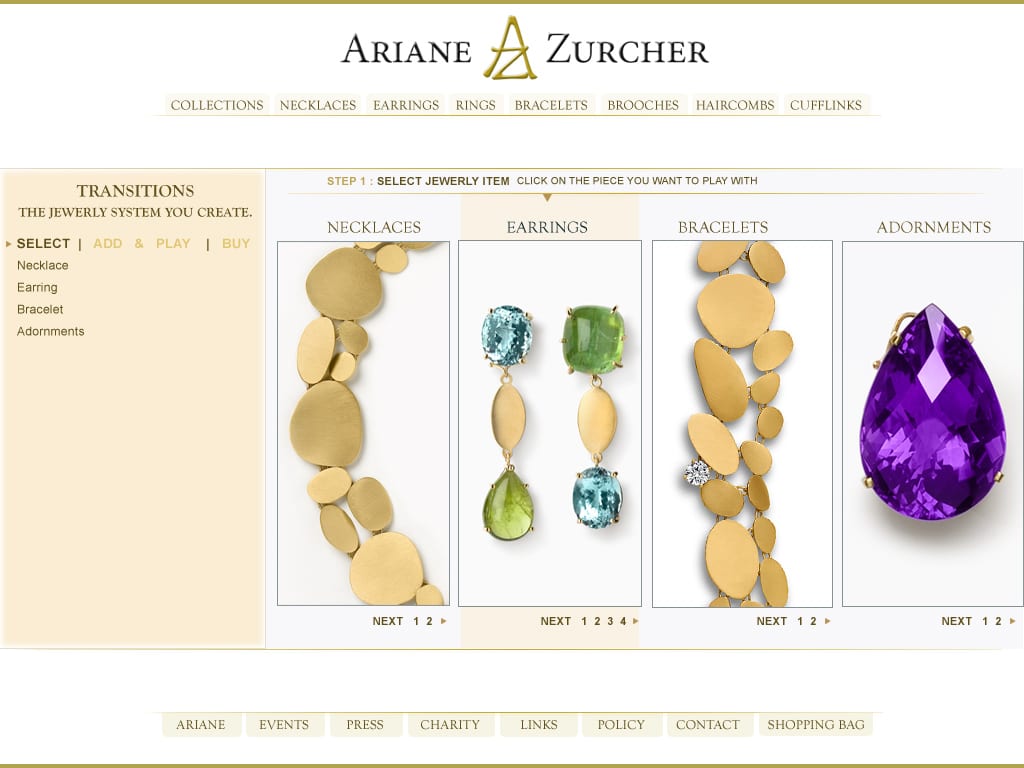
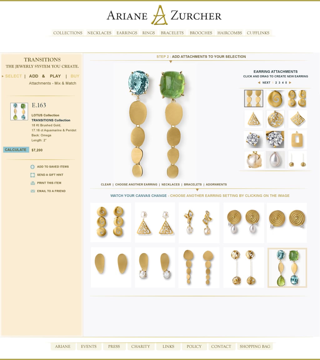
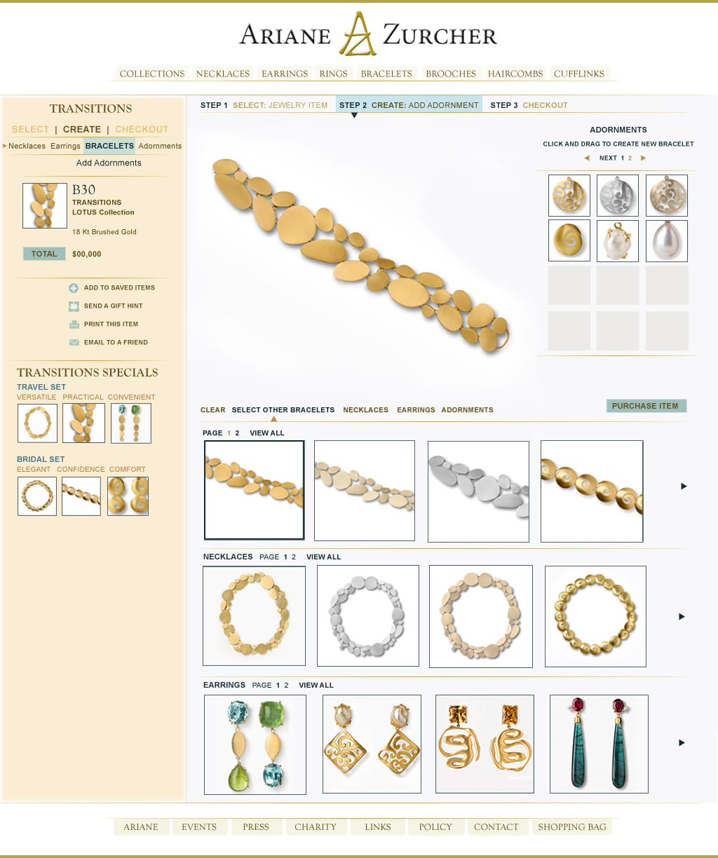
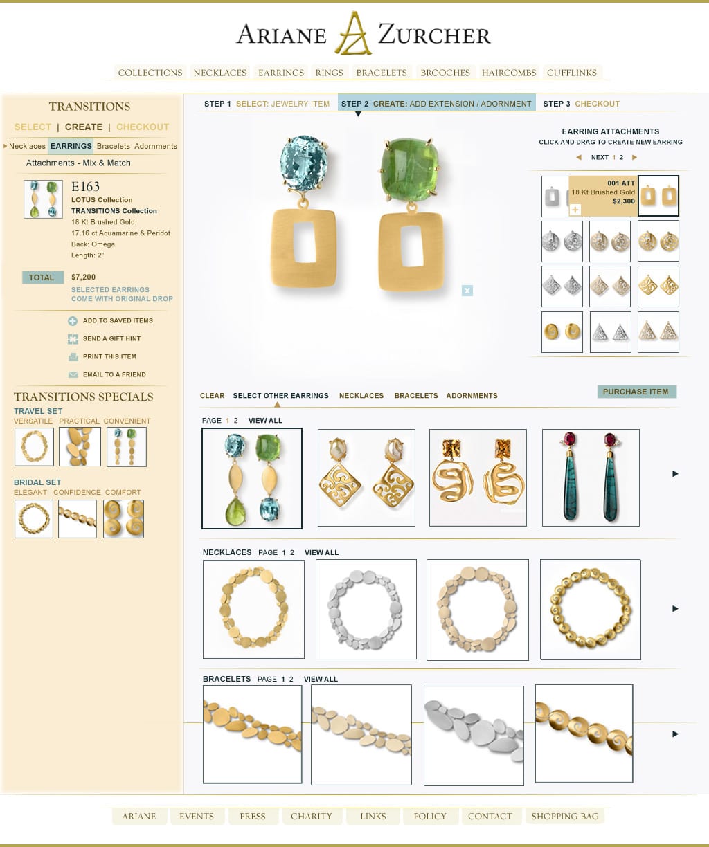
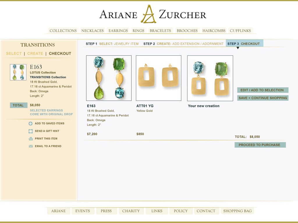
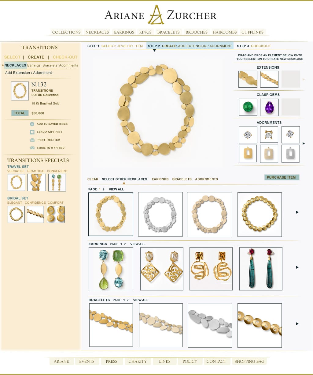
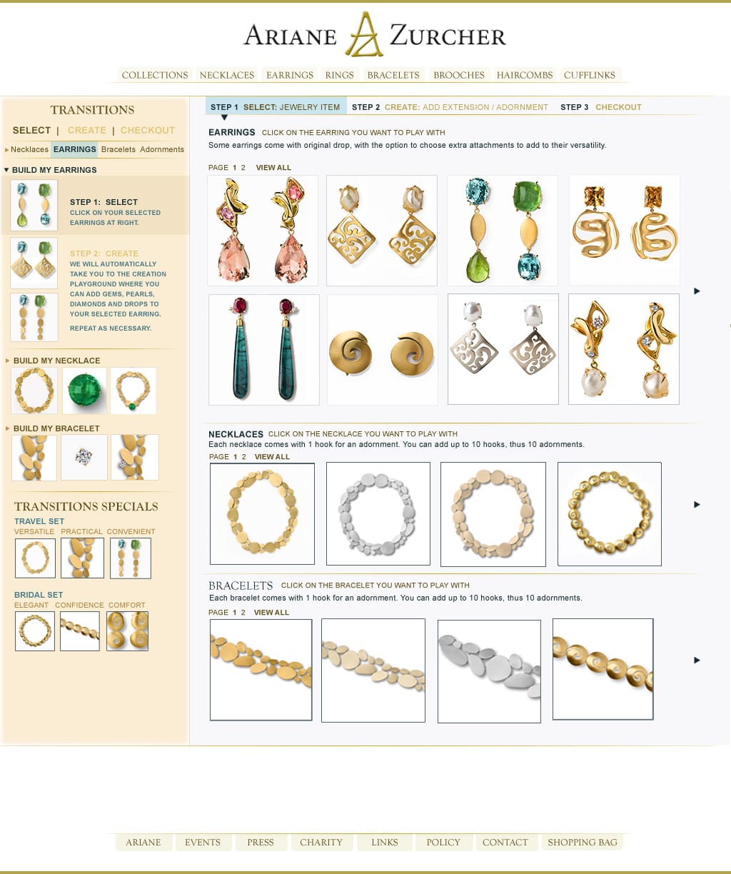
Ariane Zurcher Jewelry
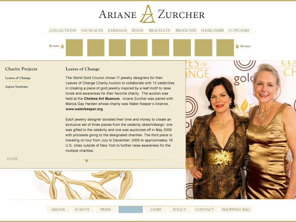
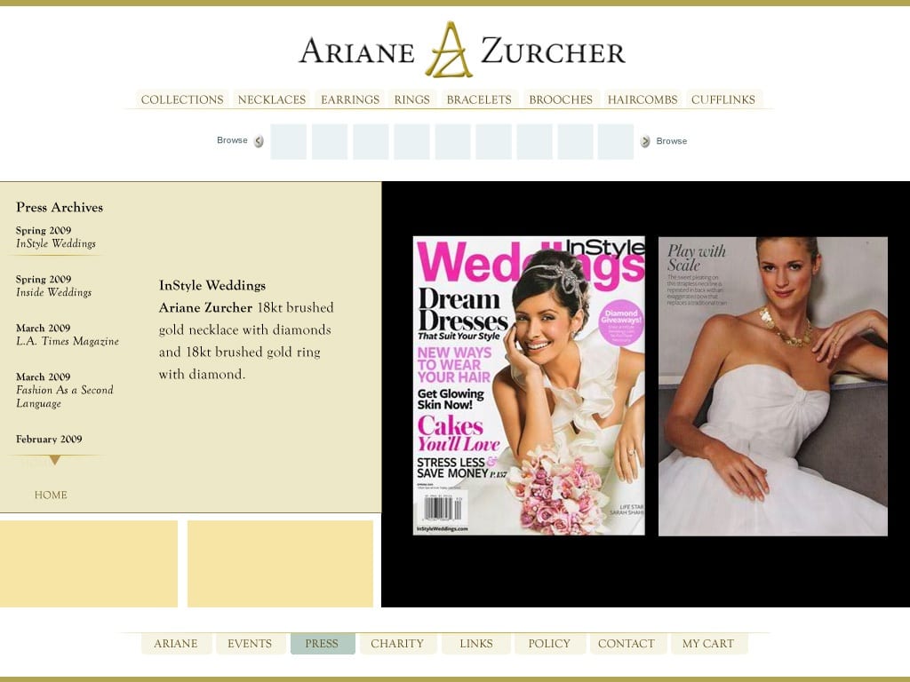
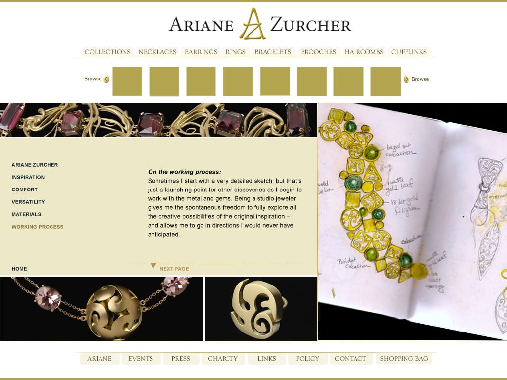
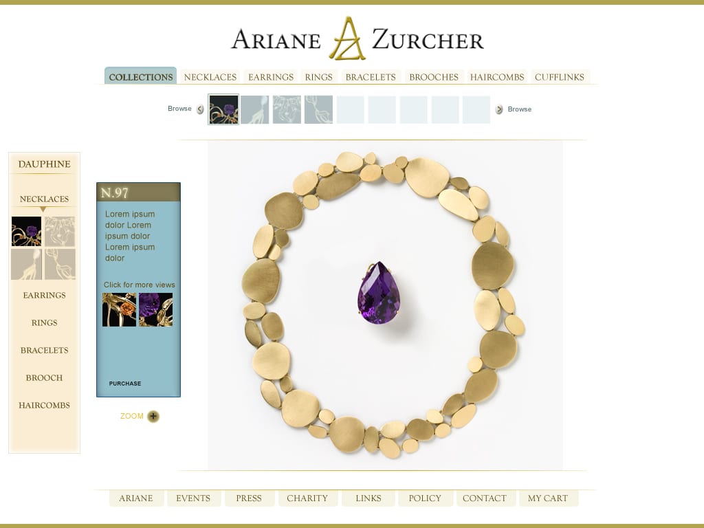
Are you a jewelry lover? If so, you”ll likely adore the uniquely original masterworks of award-winning designer Ariane Zurcher. You can browse through her stunning collection by clicking this link to ArianeZurcher.com or simply sample some of the pages featured below (and then look at the site!).
Please note: the shopping cart on the live site has been disabled, pending the creation of a new updated site that includes her latest embroidery projects and YouTube channel for “stitchers” titled, On the Other Hand.


Astro-To-Go
Alas, AstroToGo/Astro2Go is currently in mothballs, awaiting a new round of funding. It’s a shame, because it was the coolest astrology site of its time. It had the best astrology charts and daily horoscopes, plus fun extras like zodiac greeting cards and gift merchandise. You can see the eCards, t-shirts and bumper stickers in the Other Stuff section, plus the formulation and evolution of the brand identity. Here are examples of the page layouts, followed by some banners:


Milk Rocks!
Hit this link to get the full story behind MilkMedia and MilkRocks! It’s s a good case history and well worth a look. To sum up, MilkRocks was an in-school K-12 program, promoting health, nutrition, and positive values. In order to reach older students who had turned away from milk, we created MilkRocks, featuring messages from Justin Beiber, Demi Lovato, Maroon 5, Rascal Flatts, Plain White T’s–virtually every pop star that appealed to our tween target audience.
The site we designed was targeted to tweens and teens and supported by milk carton side panel messages (about six billion of them!). The big draw on the site was a contest program where kids could win VIP backstage passes to their favorite teen idol concerts, plus other fun stuff. Here are some webpage layouts followed by promo ads.


Questions? Comments? Quotes? Collaboration?
Want to know more? Ask me anything. I’m here to help.